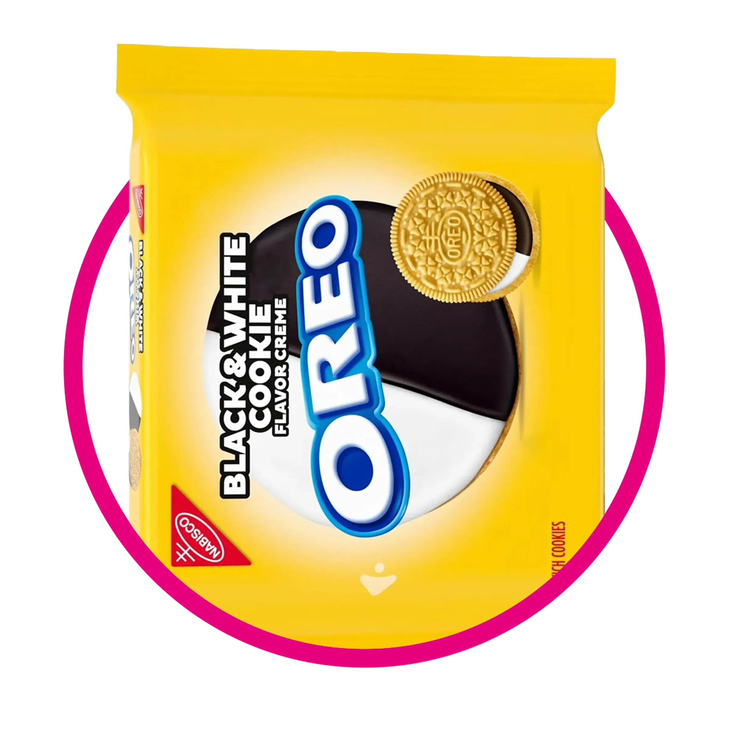
The Oreo brand identity is built on a striking black-and-white visual system that has evolved through multiple corporate ownership shifts since its introduction in 1912. The classic black-and-white color scheme, anchored by chocolate wafers and white creme, translates directly into its iconic logo typography and packaging, reflecting over a century of design standardization and corporate stewardship under Nabisco, Kraft, and Mondelēz International.
Introduction to Oreo's Enduring Visual Legacy
Few consumer packaged goods possess a visual identity as immediately recognizable worldwide as Oreo. At the heart of this recognition lies a strict black-and-white chromatic palette, mirroring the physical cookie: dark, textured chocolate wafers enclosing a stark white, circular center of sweet creme. This visual language extends from the physical product to every iteration of the corporate logo, packaging, marketing collateral, and global digital presence.
Understanding the Oreo brand identity requires examining how graphic design trends intersected with massive corporate shifts throughout the 20th and 21st centuries. From its origin under the National Biscuit Company (later known as Nabisco) to its current position as a global flagship brand under Mondelēz International, the Oreo logo has undergone a calculated evolution. This transformation moved the brand from ornate, turn-of-the-century typography to sleek, modern minimalism while maintaining its core visual equity: the signature black-and-white contrast, the playful letterforms, and the iconic floral border elements.
Historical Foundations: Nabisco and the 1912 Launch
The story of the Oreo visual identity begins on March 6, 1912, when the National Biscuit Company—later universally recognized as Nabisco—officially introduced the cookie to the market in New York City. Conceived as a premium response to a competing sandwich cookie, the initial design and packaging required a visual system that communicated indulgence, quality, and novelty.
During this era, brand marks relied heavily on ornate, Victorian-inspired typography and detailed ornamental borders. The earliest versions of the Oreo branding featured intricate lettering embossed directly onto the cookie's chocolate face and printed in monochrome or early limited-color lithography on metal tins and paper cartons.
Key Design Elements of the Early Era
- Monochrome Printing: Due to printing limitations of the early 1910s, packaging relied on high-contrast black-and-white or dark blue-and-white layouts that emphasized readability.
- Intricate Embossing: The initial cookie face featured a raised border of wreaths and a distinct typographical layout that established the baseline for future geometric refinements.
- The Nabisco Corner Seal: The red triangular Nabisco seal served as an anchor on packaging, contrasting sharply against the monochromatic imagery of the cookie itself.
The Mid-Century Modernization and Logo Refinement
As mid-century American consumer culture expanded, visual design shifted away from cluttered Victorian ornamentation toward clean, legible, and scalable brand assets. During the mid-20th century, the Oreo logo underwent significant rationalization to accommodate mass production, television advertising, and high-speed packaging lines.
The typography became bolder and more uniform. The letters "O-R-E-O" transitioned into a customized, heavy sans-serif or slab-serif hybrid style characterized by rounded terminals and a distinct structural balance. The iconic "oval" framing device—frequently referred to as the "Oreo banner" or "cartouche"—was standardized during this period. This framing device visually anchored the wordmark, using high-contrast black backgrounds with white lettering, or conversely, white backgrounds with bold black or dark blue outlines.
| Era / Decade | Primary Corporate Owner | Key Logo & Identity Characteristics | Packaging & Color Palette |
|---|---|---|---|
| 1912 – 1950s | National Biscuit Company (Nabisco) | Ornate typography, embossed floral cookie wafer borders, early block lettering. | Monochromatic tins, heavy reliance on black, white, and early metallic accents. |
| 1950s – 1970s | Nabisco | Introduction of standardized bold lettering; regularization of the oval cartouche. | Cleaner lithography, introduction of signature blue paired with stark white and black. |
| 1970s – 2000s | Nabisco / RJR Nabisco / Kraft Foods | Streamlined wordmark, removal of excessive ornamentation, higher contrast digital adaptation. | Glossy cardboard cartons, prominent photographic rendering of the cookie, high-contrast typography. |
| 2000s – Present | Kraft Foods / Mondelēz International | Minimalist flat design, digital optimization, dynamic scaling for global packaging. | Vibrant, high-definition packaging maintaining the foundational black-and-white cookie aesthetic. |
Corporate Ownership Shifts and Brand Consistency
The evolution of the Oreo brand identity cannot be separated from the complex corporate history of its parent companies. While logo redesigns occurred periodically, the overarching black-and-white brand identity acted as a stabilizing anchor through decades of mergers, acquisitions, and restructuring.
The Nabisco Era and RJR Nabisco Acquisition
For the majority of the 20th century, Nabisco maintained stewardship of the brand. However, corporate restructuring in the late 1980s introduced financial volatility. In 1985, Nabisco merged with Standard Brands to form Nabisco Brands, which was subsequently acquired by R.J. Reynolds Industries to form RJR Nabisco in 1985. This resulted in the famous leveraged buyout documented in Barbarians at the Gate. Despite shifting corporate ownership and massive financial pressures at the parent company level, brand managers fiercely protected the core visual identity of Oreo, recognizing that tampering with the black-and-white aesthetic or the iconic logo structure could alienate a fiercely loyal consumer base.
Kraft Foods and the Spin-Off into Mondelēz International
In 2000, Philip Morris Companies (later Altria Group) acquired Nabisco and merged it into Kraft Foods. Under Kraft, the Oreo brand underwent a strategic globalization initiative, standardizing its visual identity across international markets where local variations (such as similar cookies sold under different names or slightly altered packaging) had previously existed.
In October 2012, Kraft Foods split its North American grocery operations from its global snack business. The global snack division—which retained Oreo—was renamed Mondelēz International. Under Mondelēz, the Oreo visual identity underwent its most recent modernization phase, optimizing the black-and-white wordmark for digital environments, mobile applications, social media platforms, and high-definition global packaging substrates.
Anatomy of the Black-and-White Brand Identity
The deliberate choice of a black-and-white primary color palette is the psychological and aesthetic cornerstone of the Oreo brand. In graphic design and visual semiotics, monochrome systems convey timelessness, clarity, and uncompromising contrast.
- Background: High-Contrast Blue / Glossy Black
- Logo Frame: White Oval Cartouche / Banner
- Typography: Bold Black/Dark Blue Rounded Lettering
- Product: Dark Chocolate Wafers + White Creme
The Psychology of Monochrome in Snack Foods
While many food brands rely on warm, appetite-stimulating colors like red, yellow, and orange, Oreo bucked category norms by embracing the natural dark brown (visually perceived as black in logo applications) and stark white of the physical product. This inversion creates a sophisticated, bold silhouette that stands out instantly on crowded retail shelves.
- Contrast Ratio: The high contrast between the dark elements and the white typography ensures maximum legibility across varied distances, from small-scale mobile phone screens to massive billboard advertisements.
- Product-to-Brand Alignment: The logo directly mirrors the product structure. The outer black outline or background represents the chocolate wafers, while the central white lettering represents the sweet creme filling.
- Versatility in Co-Branding: The neutral black-and-white foundation allows Oreo to execute countless limited-edition collaborations (such as themed packaging for entertainment franchises or seasonal flavors) without disrupting the core brand architecture.
Typography, Geometry, and Evolution of the Wordmark
A detailed look at the letterforms reveals a continuous refinement process aimed at improving geometric balance and optical weight.
- The "O" Shapes: The outer "O" characters are intentionally wider and perfectly circular, mimicking the overhead silhouette of the sandwich cookie itself. This reinforces product association purely through typographic geometry.
- The Inner Characters ("R" and "E"): The crossbar of the "R" and the horizontal strokes of the "E" have been streamlined over decades to remove sharp serifs, transitioning into modern, friendly, rounded terminals. This shift communicates approachability and mass-market appeal while retaining structural authority.
- The Cartouche Enclosure: The curved oval background acts as a visual containment field. Historically, this oval has shifted from a physical stamped border on early metal tins to a floating vector badge on modern packaging.
Common Mistakes in Analyzing Brand Evolutions
When studying historic corporate design transitions like Oreo's, analysts and brand enthusiasts frequently commit specific missteps:
- Conflating Flavor Innovations with Identity Shifts: Introducing new wrapper colors for seasonal flavors (e.g., orange creme for Halloween or red-dyed creme for holiday editions) does not constitute a change to the core brand identity; these are temporary promotional overlays.
- Ignoring Packaging Substrate Limitations: Assuming early 20th-century monochrome packaging was an intentional minimalist design choice rather than a technological limitation of early printing presses.
- Overlooking Regional Divergence: Failing to recognize that while the core logo remained largely unified after the global rollout under Kraft and Mondelēz, packaging copy, regulatory labeling, and secondary visual assets varied significantly by country (such as the relationship with Biscuits Auchan or historical licensing agreements in foreign markets).
Frequently Asked Questions
Why is the Oreo logo black and white?
The logo's black-and-white color scheme is a direct visual representation of the physical cookie: dark chocolate wafers enclosing white creme. This high-contrast palette ensures maximum retail legibility and establishes a timeless, minimalist brand architecture that has remained consistent since the early 20th century.
Who originally created the Oreo cookie and its branding?
Oreo was created and launched in 1912 by the National Biscuit Company, which later became known as Nabisco. The earliest visual branding relied on ornate Victorian typography and embossed floral patterns on the cookie face before being streamlined into modern graphic standards.
How did corporate ownership changes affect the Oreo brand identity?
Despite moving through several parent companies—including RJR Nabisco, Kraft Foods, and finally Mondelēz International—brand guardians intentionally preserved the core black-and-white visual identity. Corporate shifts primarily impacted distribution scale, global manufacturing harmonization, and digital marketing integration rather than the foundational logo structure.
What is the significance of the oval shape in the Oreo logo?
The oval cartouche or framing device acts as a visual anchor for the "OREO" wordmark. Historically adapted from the stamped metallic borders of early packaging tins, the oval provides a clean boundary that separates the logo text from complex background imagery on retail cartons.
Is the current Oreo logo identical across all global markets?
While Mondelēz International maintains a unified global brand identity and standardized logo typography, localized packaging regulations, language requirements, and regional promotional partnerships result in minor layout variations across different international territories.
Conclusion and Next Actions
The enduring success of the Oreo brand identity demonstrates the power of visual consistency paired with disciplined corporate stewardship. By anchoring its logo design directly to the physical attributes of the product—the stark contrast of dark wafer and white creme—the brand created a timeless visual asset. For brand strategists, designers, and corporate historians, studying the evolution of Oreo provides a masterclass in balancing modernization with unwavering brand equity across a century of profound corporate transition.