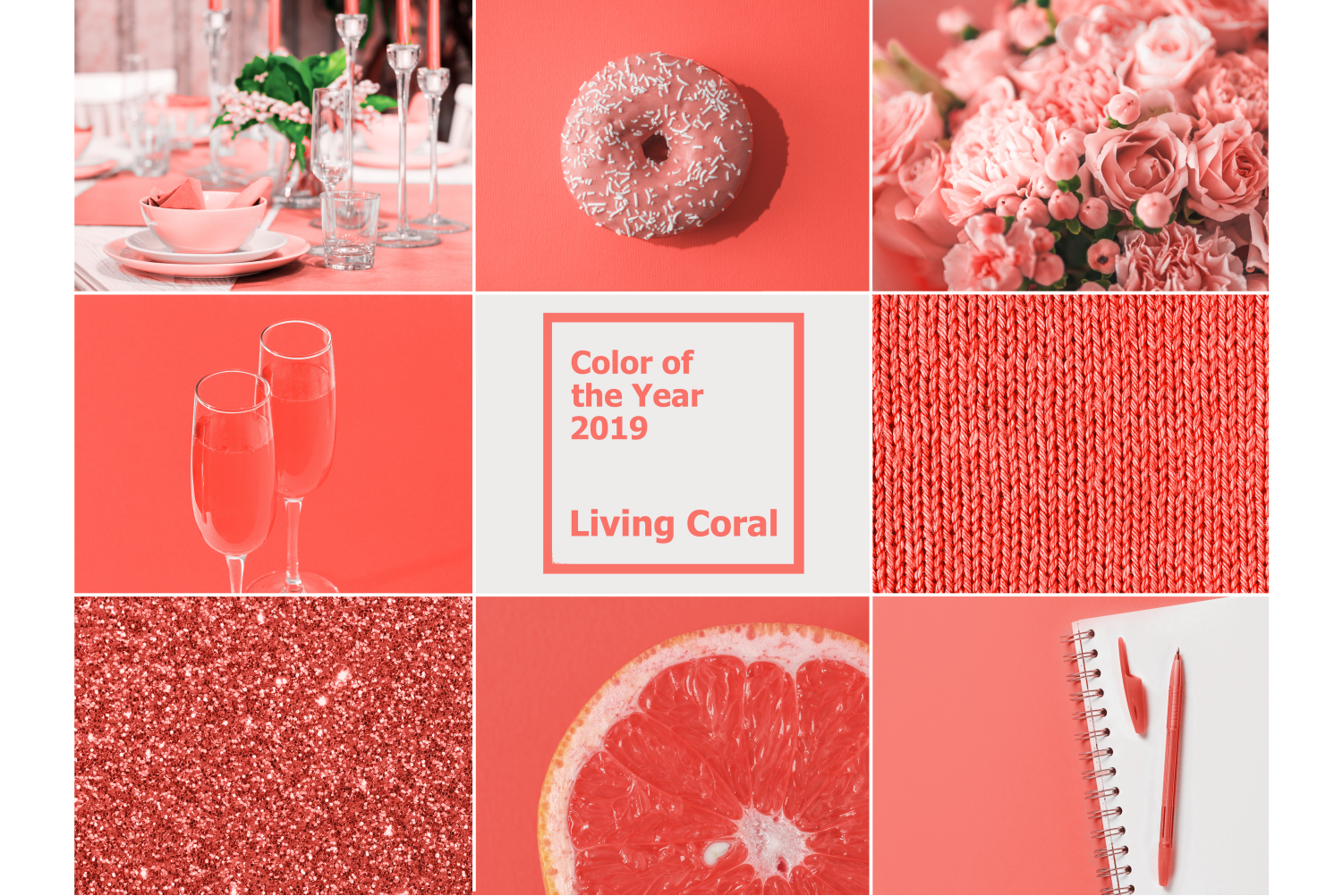
The 2019 color trends marked a decisive shift from cool minimalist grays toward warm, nature-inspired palettes and expressive statement hues. Defined by Pantone’s energetic Living Coral, Sherwin-Williams’ earthy Cavern Clay, Behr’s rich Night Watch green, and Benjamin Moore’s soothing Metropolitan gray, 2019 established a versatile design playbook blending biophilic warmth, rich jewel tones, and cozy neutral foundations.
The Cultural Context Behind the 2019 Color Palette Shift
Color trends do not emerge in a vacuum; they reflect broader societal movements, architectural shifts, and psychological needs. The color landscape of 2019 represented a clear reaction against the stark, sterile, industrial gray palettes that dominated interior design and graphic branding throughout the early-to-mid 2010s. Consumers and designers alike sought environments that felt grounded, tactile, and emotionally reassuring.
Three major cultural drivers accelerated the 2019 palette revolution:
- Biophilic Connection: As screentime increased and urban living expanded, residential interiors began incorporating elements of the natural world. Deep forest greens, rich leaf tones, and organic terracotta clay provided a visual connection to natural landscapes indoors.
- Emotional Warmth and Comfort: The desire for domestic sanctuaries led to a preference for colors with warm undertones. Pure whites and cold blue-grays were replaced by creamy mushroom neutrals, warm greiges, and comforting earth hues.
- Optimistic Expression: Alongside grounding earth tones, high-energy accents gained momentum. Bright coral, mustard yellow, and spiced terracotta were adopted in soft furnishings, accent walls, and branding collateral to inject vibrancy and playfulness into daily spaces.
By synthesizing organic grounding with optimistic warmth, the 2019 color forecast established a flexible framework that continues to influence contemporary interior design and visual media.
The Headline Shades: Defining Colors of 2019
Major global color authorities and paint manufacturers select an annual flagship hue following exhaustive research into fashion, art, media, and socio-economic shifts. In 2019, these key announcements established the benchmark for residential and commercial design palettes.
Pantone 16-1546 Living Coral
Pantone selected Living Coral (PANTONE 16-1546) as its 2019 Color of the Year. Described as an animating and life-affirming coral hue with a golden undertone, Living Coral offered a balance between natural organic life and digital vibrancy. Unlike flat pastel pinks, Living Coral carried an invigorating warmth that energized living rooms, hospitality spaces, and digital graphic campaigns. It paired exceptionally well with deep ocean blues, warm teals, and soft sandy neutrals.
Sherwin-Williams Cavern Clay (SW 7701)
Sherwin-Williams crowned Cavern Clay (SW 7701) as its top color choice. A nod to mid-century modern design and American Southwestern landscapes, Cavern Clay is a warm, sun-washed terracotta shade. It embodies a rich rust hue that bridges modern bohemian aesthetics with classic architectural millwork. When paired with natural leather, brushed brass, and warm wood grains, Cavern Clay brings immediate grounding and physical warmth to dining rooms and entryway spaces.
Benjamin Moore Metropolitan (AF-690)
Benjamin Moore took a more understated approach by selecting Metropolitan (AF-690). Representing a stylish, calm gray with soft neutral undertones, Metropolitan was engineered to quiet visual noise. Unlike the cold, blue-based grays of earlier years, Metropolitan possesses a subtle warmth that adapts fluidly to light shifts throughout the day. It served as an ideal canvas for layered textiles, black wrought-iron accents, and natural oak furnishings.
Behr Night Watch (N430-7)
Behr highlighted Night Watch (N430-7), a lush, deep botanical green that brings the restorative power of nature indoors. Drawing inspiration from dense forest canopies, Night Watch became a primary choice for moody accent walls, kitchen cabinetry, and formal dining areas. Its deep emerald-to-hunter profile absorbs excess light, creating intimate, cocoon-like spaces when executed in matte or eggshell sheens.
Core Color Movement Categories of 2019
Beyond individual brand selections, the 2019 trend cycle grouped popular shades into four distinct color families. Understanding these categories allows designers and homeowners to mix and match colors effectively without creating visual conflict.
| Warm Earth & Clay Tones (Terracotta, Rust) | Biophilic & Deep Botanical (Emerald, Hunter) |
|---|---|
| Vibrant Accent Hues (Coral, Ochre) | Moody Jewel & Soft Neutrals (Navy, Greige) |
1. Warm Earth and Clay Tones
Terracotta, burnt sienna, warm rust, and ochre anchored the warm color spectrum in 2019. These colors evoke clay pottery, weathered brick, and desert terrain. They function effectively in spaces designed for social gathering, such as dining rooms and open-concept kitchens, where their underlying warmth creates an inviting atmosphere.
2. Biophilic and Deep Botanical Greens
Greens evolved from muted sage tones into rich, moody botanical shades. Dark hunter green, forest moss, and deep olive provided a sophisticated, timeless backdrop. These shades work exceptionally well when paired with high-contrast elements, such as crisp white trim, polished marble countertops, and warm gold hardware.
3. Vibrant Accent Hues
To contrast heavy earth tones and moody dark hues, 2019 featured expressive accents. Key accent shades included:
- Spiced Honey / Mustard Yellow: Deep yellow with warm amber undertones that brings optimism without overwhelming small spaces.
- Living Coral and Blush: Softened warm pinks and corals applied through throw pillows, statement armchairs, and art prints.
- Warm Amber: Rich, glowing tones that enhance natural daylight in east- and north-facing rooms.
4. Moody Jewel Tones and Soft Neutrals
Deep navy blue, charcoal gray, plum, and soft greige rounded out the palette. Navy blue cemented its place as a "new neutral," often replacing traditional black or dark gray on interior millwork, kitchen islands, and exterior front doors. Soft greiges provided an approachable alternative to stark white walls, maintaining bright reflectivity while softening room transitions.
Technical Specifications of 2019 Flagship Colors
Comparing the technical profiles of 2019's dominant colors highlights how light reflectance, undertones, and spatial dynamics influence practical application.
| Color Name | Brand / Authority | Reference Code | Primary Undertone | Light Reflectance Value (LRV) | Ideal Room Application | Best Complementary Shades |
|---|---|---|---|---|---|---|
| Living Coral | Pantone | 16-1546 | Golden Pink / Peach | N/A (Textile/Graphic) | Accent Furniture, Textiles, Art | Teal, Deep Navy, Warm Sand |
| Cavern Clay | Sherwin-Williams | SW 7701 | Terracotta Rust | ~20 | Dining Rooms, Entrances, Accent Walls | Creamy Whites, Sage, Brushed Gold |
| Metropolitan | Benjamin Moore | AF-690 | Warm Cool-Gray | ~61 | Open-Plan Living, Bedrooms, Hallways | Matte Black, Pale Wood, Soft Blush |
| Night Watch | Behr | N430-7 | Cool Deep Forest Green | ~14 | Bedrooms, Libraries, Kitchen Cabinets | Warm Ochre, Cream, Brass |
| Spiced Honey | Dulux | 00YY 26/220 | Amber Ochre | ~34 | Kitchens, Creative Studios, Foyers | Warm Taupe, Forest Green, Slate Blue |
Note: Light Reflectance Value (LRV) measures the percentage of light a paint color reflects on a scale from 0 (absolute black) to 100 (pure white).
Practical Application Guide: Implementing 2019 Shades Across Interior Spaces
Translating trend palettes into architectural interiors requires balancing light, texture, paint sheen, and architectural proportions. Below is a room-by room strategy for applying 2019 color principles.
Living Rooms: Balancing Statement Walls with Natural Textures
In main living areas, dramatic shades like Behr's Night Watch or Sherwin-Williams' Cavern Clay work best when grounded by natural organic materials.
Wall Application: Apply deep greens or terracotta tones to an accent wall behind a sofa or entertainment center. For south-facing rooms with abundant natural light, painting all four walls in a matte finish creates a sophisticated, cozy library feel.
Furniture & Accessories: Pair dark walls with light-toned upholstery—such as oatmeal linen, cognac leather, or warm camel wool. Introduce raw timber elements and brushed brass lamps to highlight warm undertones.
Living Room Design Palette:
- Deep Green/Terracotta: Primary Feature Wall
- Warm Oatmeal / Camel: Upholstery Textiles
- Natural Oak / Leather: Furniture & Accents
- Polished Brass / Copper: Lighting Fixtures
Kitchens: Moving Beyond the All-White Kitchen
The 2019 trend cycle saw a major shift away from monochromatic white kitchens toward two-toned cabinetry and saturated island bases.
- Cabinetry: Utilize deep navy or forest green (e.g., Night Watch) on lower cabinets or central islands, while keeping upper cabinets or open shelving in warm white or soft greige like Benjamin Moore Metropolitan.
- Hardware & Fixtures: Replace polished chrome with warm metal accents like matte brass, oil-rubbed bronze, or warm copper. Warm hardware enhances the richness of deep greens and clays.
Bedrooms: Creating Serene, Low-Contrast Retreats
Bedrooms benefit from low-contrast palettes that promote relaxation.
- Wall Application: Soft neutrals such as Metropolitan AF-690 create a serene backdrop that reflects natural morning light softly without harsh glare.
- Textile Layering: Introduce 2019 accent colors through bedding, throw blankets, and area rugs. Combine dusty rose or blush linen sheets with a terracotta knit blanket and velvet accent pillows in muted forest green.
Exterior Doors and Architectural Millwork
Color trends from 2019 offer excellent inspiration for updating curb appeal and interior woodwork.
- Front Doors: Cavern Clay or deep moody navy creates an inviting entryway point against white, gray, or brick exteriors.
- Interior Trim & Wainscoting: Painting doors, board-and-batten trim, or wainscoting a shade darker than the adjoining walls (e.g., Metropolitan gray trim against a off-white wall) adds architectural interest and subtle contrast.
Four Winning 2019 Palette Schemes
To help coordinate complete room designs, here are four curated color combinations based on the primary 2019 design movements:
1. The Desert Modernist Palette
- Primary Wall: Sherwin-Williams Cavern Clay (SW 7701)
- Trim/Ceiling: Crisp Creamy White
- Accent Colors: Dusty Sage Green, Warm Ochre
- Material Pairings: Light Oak, Leather, Woven Jute, Terracotta Pots
2. The Botanical Sanctuary Palette
- Primary Wall: Behr Night Watch (N430-7)
- Trim/Ceiling: Benjamin Moore Metropolitan (AF-690)
- Accent Colors: Warm Amber, Matte Black
- Material Pairings: Walnut Wood, Polished Brass, Velvet, White Marble
3. The Coastal Warmth Palette
- Primary Wall: Soft Sandy Greige
- Accent Wall / Millwork: Deep Ocean Navy
- Pop Accent: Pantone Living Coral (PANTONE 16-1546)
- Material Pairings: Rattan, Driftwood, Light Linen, Brushed Nickel
4. The Urban Minimalist Palette
- Primary Wall: Benjamin Moore Metropolitan (AF-690)
- Secondary Wall / Trim: Charcoal Slate
- Accent Colors: Soft Terracotta, Muted Mustard
- Material Pairings: Black Steel, Concrete, Natural Linen, Matte Ceramics
Selecting the Right Paint Sheen for Dark and Warm Tones
Choosing the correct color is only half the process; selecting the proper paint finish or sheen determines how light interacts with the pigment.
Light Reflection by Paint Sheen Level: Low Reflectivity to High Reflectivity
| Flat / Matte | Eggshell | Satin / Low Lustre | Semi-Gloss / Gloss |
|---|---|---|---|
| Hide Defects (Ceilings/Bed) | Velvety Finish (Living Rooms) | Moisture Guard (Bath/Kitchens) | High Durability (Trim/Doors) |
- Flat or Matte Finish:
- Best For: Ceilings, bedrooms, and low-traffic accent walls featuring deep colors like Night Watch or Cavern Clay.
- Why: Matte finishes non-directionally absorb light, rich color depth without surface sheen glare.
- Eggshell Finish:
- Best For: Living rooms, hallways, and dining spaces using soft neutrals like Metropolitan.
- Why: Provides a subtle, velvety luster that can be gently wiped clean without sacrificing soft color richness.
- Satin or Semi-Gloss Finish:
- Best For: Kitchen cabinets, bathroom vanities, window trim, and front doors.
- Why: Offers superior moisture resistance and durability, highlighting clean architectural lines and millwork detail.
Common Mistakes When Working With 2019 Color Palettes
While the 2019 color guide provides a rich array of choices, improper execution can lead to lighting issues or visual clutter.
- Ignoring Room Orientation and Lighting: Deep shades like Night Watch (LRV 14) or Cavern Clay (LRV 20) absorb substantial light. Placing these colors in a dark, north-facing room without adequate artificial lighting can make the space feel cramped and gloomy. Always test paint swatches under both natural daylight and warm evening artificial light (2700K–3000K LED bulbs).
- Over-Using High-Vibrancy Accents: Bright colors like Living Coral or saturated mustard yellow are designed as accents. Applying them across all four walls can overwhelm a residential space. Limit vibrant hues to 10–15% of the overall room palette (e.g., pillows, artwork, rug motifs, or single accent armchairs).
- Failing to Balance Cool and Warm Undertones: Mixing cool blue-grays with warm terracotta without an integrating transitional neutral can create visual dissonance. Ensure your palette includes a bridging neutral—such as a warm greige or creamy off-white—to tie contrasting warm and cool elements together seamlessly.
Frequently Asked Questions
What was the official Pantone Color of the Year in 2019?
The official Pantone Color of the Year for 2019 was Living Coral (PANTONE 16-1546). It is an invigorating coral hue with a warm golden undertone, selected to represent optimism, human connection, and natural underwater ecosystems.
How did deep green paint colors become popular in 2019?
Deep green shades, led by Behr’s 2019 Color of the Year Night Watch, gained prominence through the growth of biophilic design. Designers turned to deep botanical greens to bring outdoor natural elements inside, creating relaxing, nature-grounded indoor environments.
Why did design trends shift away from cool grays around 2019?
Design trends shifted because stark, cold-toned grays began to feel impersonal and sterile. Homeowners and interior designers sought cozy, welcoming spaces, prompting a pivot toward warm neutrals, soft greiges, rich terracotta tones, and earthy greens.
What paint sheen works best for dark shades like Cavern Clay or Night Watch?
For dark, dramatic shades on living room or bedroom walls, a matte or eggshell sheen works best. Matte finishes absorb glare and allow deep pigments to appear smooth and saturated. For high-moisture or high-traffic areas like kitchens and doors, use a satin or semi-gloss finish for added durability.
How can I incorporate 2019 color trends without repainting entire rooms?
You can introduce 2019 trends through low-commitment decor updates. Swap out accent textiles—such as throw blankets, velvet pillows, and rug runners—with coral, mustard, or terracotta tones. Additionally, painting an isolated feature, such as a front door, a kitchen island, or an entryway bench, introduces trend hues without requiring a full-room paint project.
Recommended Next Steps
To successfully incorporate these timeless 2019 color trends into your design projects:
- Order Sample Pots: Test large 2' x 2' paint swatches of key shades like Cavern Clay, Night Watch, or Metropolitan directly on your walls. Observe how the undertones shift during morning natural light, afternoon sun, and artificial evening lighting.
- Apply the 60-30-10 Rule: Structure your room's color distribution by using 60% of a foundational neutral (e.g., Metropolitan greige), 30% of a secondary color (e.g., deep green cabinetry or natural wood tones), and 10% of a high-energy accent (e.g., Living Coral or warm ochre accessories).
- Coordinate Finishes and Lighting: Pair warm, earthy tones with warm LED lighting (2700K to 3000K) and tactile materials like raw oak, unlacquered brass, leather, and woven linens to achieve a modern visual style.