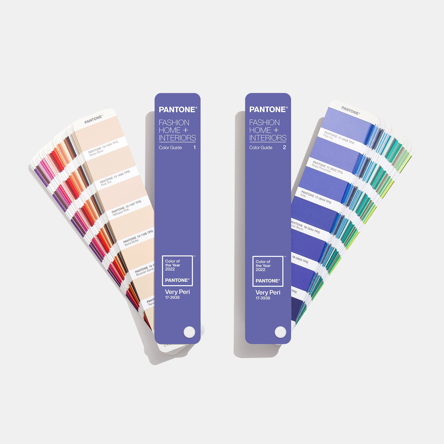
The year 2020 was defined by a shift toward stability and nature, anchored by Pantone’s Classic Blue and complemented by earthy tones like Sherwin-Williams’ Naval and Behr’s Back to Nature. These hues reflected a global desire for calm, reliability, and connection to the environment during a transformative and challenging historical period.
The Foundation of a Decade: Pantone’s Classic Blue
As the world stood on the precipice of a new decade, the Pantone Color Institute selected Classic Blue (19-4052) as the 2020 Color of the Year. This choice was deliberate, aiming to provide a sense of peace and tranquility to the human spirit. Looking back from 2026, we can see how this selection served as a psychological anchor before the global volatility that would soon follow.
Classic Blue is a non-aggressive, easily relatable shade. Unlike the more adventurous "Ultra Violet" of 2018 or the energetic "Living Coral" of 2019, Classic Blue was intended to be "dependable." It is the color of the sky at dusk—not the deep black of midnight, but a transitionary shade that suggests a new day is coming.
In professional design, Classic Blue was widely adopted for its versatility. It functioned as a "new neutral," pairing effortlessly with metallics, creams, and even bold yellows. Its technical depth lies in its Light Reflectance Value (LRV), which is approximately 9. This low LRV means the color absorbs a significant amount of light, making it ideal for creating intimate, grounded spaces such as libraries, master bedrooms, and high-end retail environments.
The Rise of the Dark Neutrals: Sherwin-Williams’ Naval
While Pantone focused on the sky, Sherwin-Williams looked to the sea with their 2020 selection: Naval (SW 6244). This deep, rich navy blue signaled a departure from the "cool grays" that had dominated the previous decade. Naval was a bold statement that dark colors could still feel neutral and welcoming.
The selection of Naval highlighted a growing trend in "Art Deco" revival. Designers used this hue to create high-contrast environments, often pairing it with brushed gold hardware and natural wood tones. From a technical standpoint, Naval is a saturated blue with a slight gray undertone, which prevents it from feeling too "primary."
By 2020, the industry was moving toward "Biophilic Design"—the practice of connecting occupants to nature through color and material. Naval represented the "Deep Sea" aspect of this movement. It offered a sense of "preppy" sophistication while remaining grounded in the natural world. In kitchen design, this color became a staple for island cabinetry, providing a weighted base that anchored lighter countertops and backsplashes.
Biophilic Harmony: Behr’s Back to Nature
As the global population began to spend more time indoors during the 2020 lockdowns, the need for outdoor connectivity became a physiological necessity. Behr’s 2020 Color of the Year, Back to Nature (S340-4), anticipated this shift perfectly. This "meadow-inspired" green was a soft, yellow-based hue designed to bring the restorative power of the outdoors into the home.
Green is historically associated with health and renewal. Back to Nature was specifically engineered to be a "neutral green." It lacked the starkness of forest green or the neon quality of lime. Instead, it sat comfortably in the middle of the spectrum, making it an excellent choice for living rooms and entryways.
The technical success of Back to Nature came from its ability to reduce visual fatigue. In an era where screen time was increasing exponentially, soft greens provided a "visual rest." When paired with light-toned woods like white oak or birch, this hue created a "Scandi-Boho" aesthetic that remained popular well into the mid-2020s.
The New Romanticism: Benjamin Moore’s First Light
In stark contrast to the deep blues and earthy greens, Benjamin Moore selected First Light (2102-70) as their defining 2020 hue. This was a soft, airy pink that served as an evolution of the "Millennial Pink" phenomenon. However, First Light was less about "trendiness" and more about "optimism."
First Light was positioned as a replacement for traditional beige or off-white. It was a "blush" that reacted beautifully to different lighting conditions. In the morning light, it appeared crisp and energizing; under warm evening lamps, it softened into a cozy, candlelit glow.
The inclusion of a pink hue in the 2020 palette was significant because it challenged the gendered perceptions of color. Designers used First Light in "gender-neutral" nurseries, modern offices, and sophisticated dining rooms. It proved that a hint of warmth could modernize a space without the sterility of pure white.
Comparative Analysis of 2020’s Defining Hues
To understand how these colors functioned together, it is helpful to compare their technical attributes and intended psychological impacts.
| Brand | Color Name | Color Code | Primary Mood | Best Application |
|---|---|---|---|---|
| Pantone | Classic Blue | 19-4052 | Stability & Trust | Branding, Fashion, Accent Walls |
| Sherwin-Williams | Naval | SW 6244 | Sophistication | Kitchen Cabinets, Exterior Doors |
| Behr | Back to Nature | S340-4 | Vitality & Calm | Living Areas, Sunrooms |
| Benjamin Moore | First Light | 2102-70 | Optimism | Bedrooms, Ceilings, Small Spaces |
| PPG | Chinese Porcelain | PPG1160-6 | Quietude | Study Rooms, Bathrooms |
The Impact of Global Events on Color Psychology in 2020
The defining hues of 2020 were selected in late 2019, months before the COVID-19 pandemic changed the world. However, the themes of "calm," "stability," and "nature" became more relevant than the forecasters could have imagined.
The "Sanctuary" Effect
As homes became offices, schools, and gyms, the 2020 color palette had to work harder. Colors like Classic Blue and Naval provided a sense of boundary. A dark blue wall became a professional backdrop for video calls, signaling authority and calm. Meanwhile, First Light and Back to Nature helped soften the "clinical" feel of homes that were suddenly being cleaned and sanitized more frequently.
The Retreat from "Fast Design"
The 2020 colors also marked a retreat from "disposable" trends. These hues were "timeless." They were intended to last a decade, not a season. This shift was a response to the growing global awareness of sustainability. By choosing colors that were inherently linked to the earth and sky, manufacturers encouraged consumers to build environments that they wouldn't feel the need to repaint every two years.
Technical Implementation: Working with 2020 Palettes
Applying these colors requires an understanding of metamerism—the way a color looks different under different light sources.
- Blue Tones (Classic Blue & Naval): These colors have high "chroma" (intensity). In north-facing rooms with cool, blueish natural light, they can feel cold or "inky." To balance this, designers often recommend using "warm" LED bulbs (2700K to 3000K) to bring out the depth of the blue without it turning flat.
- The Green Influence (Back to Nature): This color is highly susceptible to surrounding reflections. If you have a bright red rug, a wall painted in "Back to Nature" might take on a muddy appearance. It works best when surrounded by other natural materials like jute, leather, and linen.
- The Pink Shift (First Light): This is a high-LRV color (approx. 77). It reflects a lot of light, which can make a small room feel much larger. However, it requires a "flat" or "eggshell" finish; a high-gloss pink can often look like plastic or a commercial environment.
The Legacy of 2020 Hues in 2026
From our current vantage point in 2026, the colors of 2020 look like the starting point for several major design movements. The "Naval" and "Classic Blue" trend eventually gave way to the "Dark Academia" aesthetic, characterized by moody, scholarly environments.
The "Back to Nature" green was the precursor to the massive "Biophilic Urbanism" movement, where indoor gardens and "living walls" became standard in high-end architecture. Meanwhile, "First Light" paved the way for the "Warm Minimalist" trend, which replaced gray-and-white interiors with "sand," "terracotta," and "blush" tones.
2020 was a year of looking inward. The colors reflected a collective need to feel safe, grounded, and connected to the broader world outside our windows. They weren't just decorative choices; they were emotional responses to a world in flux.
Frequently Asked Questions
Why was Classic Blue chosen as the color of the year for 2020?
Pantone chose Classic Blue because it represented a "solid and dependable foundation" as the world entered a new decade. It was intended to instill calm, confidence, and connection, acting as a transitionary hue that felt both familiar and forward-looking.
How did the pandemic affect 2020 color trends?
While the colors were chosen before the pandemic, the global lockdowns intensified the demand for the "calming" and "nature-based" qualities of these hues. There was a notable shift toward "cocooning," where people used deep blues and soft greens to create a sense of security and a sanctuary-like atmosphere in their homes.
Are the 2020 colors still relevant in 2026?
Yes. Many of the 2020 colors, particularly the deep navies and soft greens, have become "modern classics." They are no longer viewed as "trends" but as "standard neutrals." In 2026, these colors are frequently used in "sustainable" and "wellness-focused" design projects because of their timeless appeal and connection to nature.
What colors pair best with a 2020 palette?
The 2020 palette is remarkably versatile. Classic Blue pairs well with warm wood tones and copper. Naval is often accented with gold or crisp white. Back to Nature works best with other earth tones like terracotta and tan, while First Light is often used alongside charcoal gray or deep sage green for a balanced, modern look.
What is the LRV of the major 2020 colors?
LRV, or Light Reflectance Value, measures how much light a color reflects. First Light has a high LRV (approx. 77), making it very reflective. Back to Nature is in the middle (approx. 46), while Naval (approx. 4) and Classic Blue (approx. 9) have very low LRVs, meaning they absorb most of the light that hits them.
Final Recommendation
For those looking to incorporate the defining hues of 2020 into a modern 2026 space, the most effective approach is to focus on texture and finish. Use Classic Blue or Naval in matte finishes for cabinetry or accent walls to avoid unwanted glare. Complement these with "biophilic" elements—such as indoor plants and natural stone—to lean into the restorative themes of Back to Nature. By balancing these grounded, earthy tones with the optimistic softness of First Light, you can create a space that feels both historically significant and timelessly comfortable.