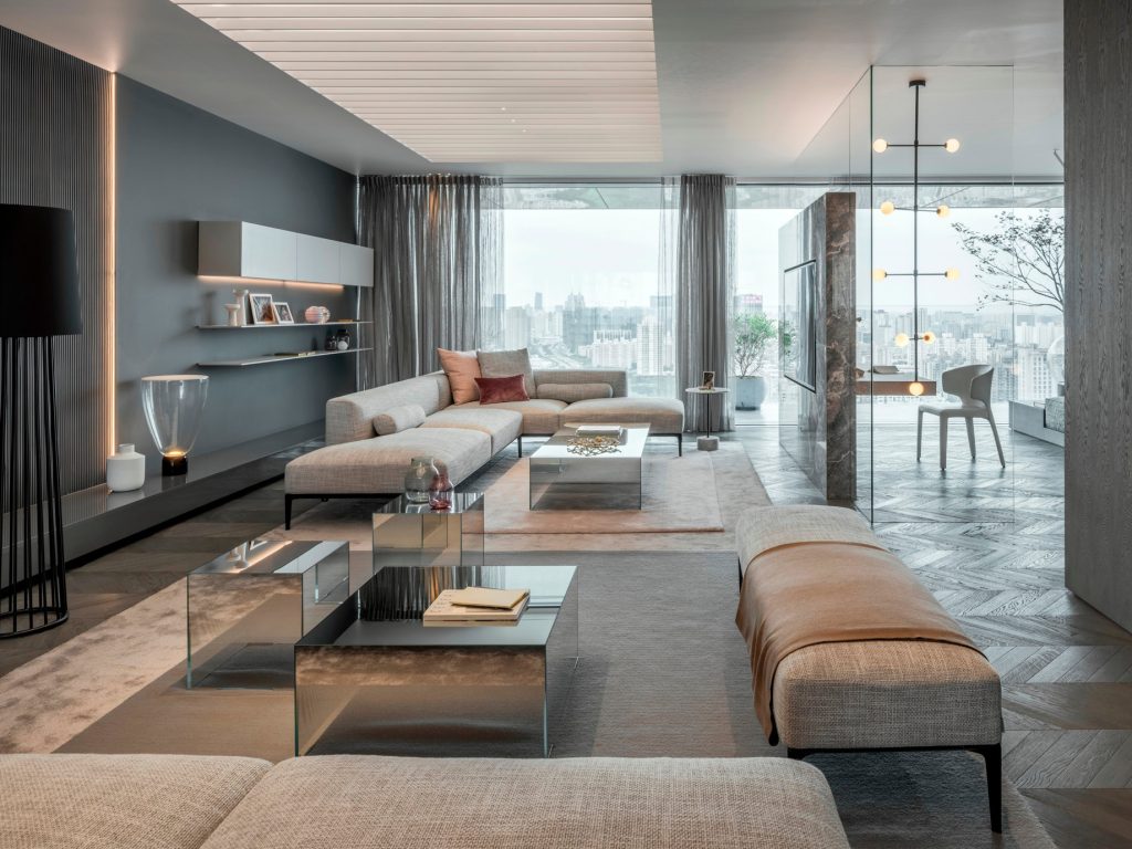
Designing a modern apartment inspired by the sophisticated and monochromatic aesthetics of the "Fifty Shades of Grey" phenomenon requires a delicate balance of deep color theory, tactile texture layering, and dramatic lighting to avoid a cold or clinical atmosphere. This comprehensive guide details how to master a gray-centric interior palette, merging high-end luxury, industrial elements, and moody elegance into a cohesive living space.
Understanding the Monochrome Palette: More Than Just Gray
Achieving a high-end apartment design using a gray color scheme requires moving far beyond a single, flat shade of paint. The secret to a sophisticated monochromatic interior lies in understanding undertones, saturation levels, and the interplay of light across various surfaces. Without a strategic approach, gray spaces can easily feel uninviting, sterile, or reminiscent of unfinished concrete.
Identifying Cool versus Warm Undertones
Every gray paint chip, fabric, and stone slab features a subtle undertone that dictates how it interacts with natural and artificial light.
- Cool Undertones: Grays infused with blue, green, or violet lean modern, crisp, and industrial. They excel in sunlit spaces with large windows because the bright light warms them up organically.
- Warm Undertones: Grays carrying brown, beige (often called "greige"), or taupe create an inviting, sophisticated, and enveloping atmosphere. These tones are ideal for north-facing apartments or urban spaces lacking abundant natural sunlight.
Mixing these undertones haphazardly creates visual friction. Sticking to a dominant family—either strictly cool or strictly warm—ensures harmony throughout the apartment layout.
The 60-30-10 Rule in a Gray Scheme
To prevent monotony, professional interior designers apply the classic 60-30-10 proportion rule specifically tailored for moody, neutral palettes:
- 60% Dominant Tone: Soft, mid-tone grays applied to walls, large area rugs, and oversized foundational furniture pieces like a linen sectional or a tailored sofa.
- 30% Secondary Tone: Charcoal, slate, or dark walnut wood tones used for accent walls, medium-sized furniture, window treatments, and statement armchairs.
- 10% Accent Tone: Polished chrome, brushed brass, matte black, or jewel-toned accessories (such as deep emerald or rich burgundy) introduced via throw pillows, artwork, and metallic hardware.
Layering Textures to Eliminate Flatness
The primary danger of a monochromatic design scheme is visual flatness. When color variation is minimized, texture must take center stage to create depth, comfort, and tactile interest.
| Texture Category | Application Examples in a Gray Apartment |
|---|---|
| Soft & Plush | Bouclé upholstery, velvet drapes, cashmere throws |
| Rough & Organic | Exposed concrete, reclaimed wood, slubby linen |
| Sleek & Reflective | Polished marble, smoked glass, high-gloss lacquer |
| Structured & Matte | Matte black steel frames, leather, honed granite |
Combining Soft Textiles with Hard Architectural Elements
Luxury apartments rely on the tension between opposing material types. Pair a sleek, low-profile leather sofa with a heavy wool or jute area rug. Introduce heavy velvet blackout drapery that pools slightly on the floor against smooth hardwood or polished concrete flooring. This contrast tricks the eye into perceiving immense richness and dimension, even within a restricted color palette.
Incorporating Natural Stone and Metal Accents
Raw materials anchor a gray apartment design, elevating it from a simple paint project to an upscale architectural environment.
- Natural Stone: Honed Carrara marble countertops, slate fireplace surrounds, and terrazzo tile introduce organic veining that breaks up solid gray expanses.
- Metal Accents: While chrome and stainless steel fit a hyper-modern aesthetic, brushed brass and unlacquered copper introduce warmth to cool gray rooms. Matte black hardware provides sharp definition, anchoring doors, cabinetry, and lighting fixtures.
Lighting Engineering: Mood, Shadow, and Drama
Lighting is the single most important factor in determining whether a gray apartment feels like a luxurious penthouse or a gloomy cave. Because gray absorbs light rather than reflecting it intensely, layering multiple light sources is essential.
Layered Lighting Design
Relying solely on harsh overhead ceiling fixtures flattens a room and ruins the atmosphere. A professional lighting scheme incorporates three distinct layers:
- Ambient Lighting: Dimmer-controlled recessed architectural lighting or understated flush mounts that establish the baseline luminescence.
- Task Lighting: Sleek reading lamps, under-cabinet LED strips in the kitchen, and integrated lighting inside glass-front display shelving.
- Accent Lighting: Picture lights highlighting dark-framed artwork, floor-to-ceiling LED light channels behind headboards, and directional spotlights focusing on textured accent walls.
Color Temperature Considerations
The Kelvin (K) rating of light bulbs dictates how gray paint reacts in the evening. Avoid harsh daylight bulbs (above 4000K), which turn cool grays into an icy blue. Instead, opt for warm-to-neutral LED bulbs ranging from 2700K to 3000K. This range preserves the richness of charcoal and greige walls while maintaining a welcoming, residential ambiance.
Room-by-Room Design Strategies
Translating a cohesive gray concept across different living zones requires targeted functional adaptations.
The Living Room: Sophisticated Focal Points
The living room should serve as the primary statement space. Anchor the room with a charcoal or deep dove-gray low-slung sofa. Introduce a concrete-top coffee table or a dark smoked-glass center table. Keep window treatments minimal to maximize natural light, utilizing motorized solar shades paired with rich drapery panels.
The Bedroom: Moody Sanctuary
Bedrooms benefit from a cocooning atmosphere. Embrace darker shades here—consider wrapping the walls in a deep charcoal or graphite hue. Layer the bed with crisp white or pale silver high-thread-count cotton sheets, topped with a heavy slate-gray quilted coverlet and faux-fur throws. Upholstered headboards in tufted velvet add acoustic dampening and tactile luxury.
The Kitchen and Dining Area: Sleek Functionality
Kitchens in this design style thrive on minimalist cabinetry paired with integrated appliances. Handleless matte gray or black slab cabinets create a streamlined, uninterrupted look. Pair these with waterfall-edge quartz countertops featuring heavy gray veining. In the dining area, a dark wood or smoked glass table surrounded by cantilevered leather chairs completes the look.
Common Mistakes to Avoid in Monochromatic Design
Even experienced DIY decorators can miscalculate when working with a strictly controlled color palette. Avoiding these common pitfalls saves time, money, and frustration.
- Ignoring Natural Light Changes: Failing to test large paint swatches on all four walls throughout different times of the day often results in unexpected purple or green undertones appearing under shifting sunlight.
- Overusing Pure White: While crisp white trim provides necessary contrast, excessive stark white can chop up a gray room, making it look choppy and disjointed rather than seamless and expansive.
- Neglecting Scale and Proportion: Oversized furniture in a small gray apartment makes the space feel cramped, while tiny furniture pieces get lost against large expanses of neutral walls. Balance heavy foundational pieces with leggy, open-frame accent chairs and tables.
- Skipping Greenery: A common oversight in monochromatic spaces is the complete omission of living elements. Introducing tall fiddle-leaf figs, snake plants, or minimalist cascading pothos injects organic life and breaks up the industrial severity of gray tones.
Frequently Asked Questions
What paint colors work best for a luxury gray apartment?
Popular industry choices include Benjamin Moore’s Stonington Gray or Chelsea Gray, and Sherwin-Williams’ Repose Gray or Peppercorn. Always test physical sample boards in your specific apartment before committing to whole-room painting.
How do I keep a gray apartment from looking cold and depressing?
Combat coldness by introducing warm wood tones, layered textiles like boucle and velvet, warm lighting (2700K–3000K), and metallic accents such as brushed brass or bronze to balance out cool gray surfaces.
What flooring materials complement a monochromatic gray interior?
Wide-plank white oak flooring with a neutral or wire-brushed finish adds necessary warmth. Alternatively, large-format polished concrete or charcoal slate tiles reinforce an industrial, high-end urban aesthetic.
Can I mix different shades of gray in the same room?
Yes. In fact, layering varying tones—from pale silver and dove gray to charcoal and near-black—is essential to creating visual depth and preventing a flat, uninspired environment.
Next Actions for Your Apartment Project
Begin your apartment transformation by auditing your current lighting and natural exposure. Purchase large peel-and-sample paint sheets to evaluate undertones against your flooring and furniture. Prioritize foundational investments—such as a quality sofa and window treatments—before layering in textiles, metals, and statement decor pieces to curate a sophisticated, balanced interior.