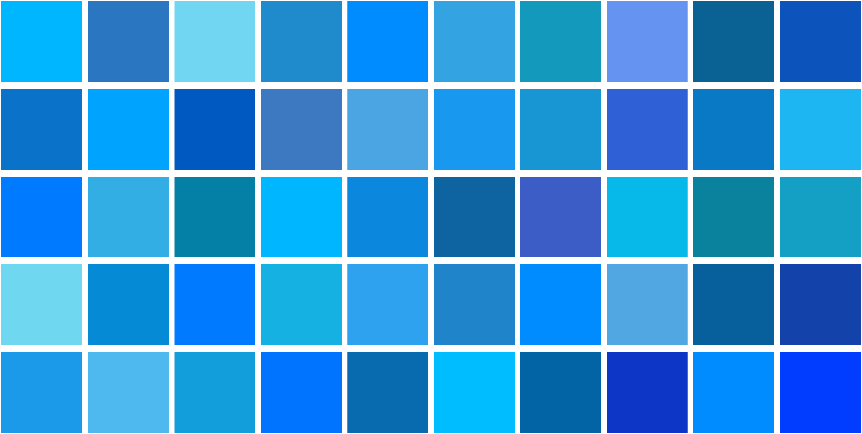
The phrase "50 shades of blue" evokes a vast, multi-layered spectrum of colors ranging from the deepest midnight navy to the softest, palest ice cyan. In art, design, color theory, and psychology, this immense variety of hues serves as a fundamental vocabulary for creating mood, establishing spatial depth, and conveying distinct emotional and cultural meanings.
The Etymology and Cultural Resonance of Blue
Blue holds a unique, revered place in human history. Unlike red, yellow, or green, natural blue pigments were historically rare, difficult to extract, and exceptionally expensive to produce. From the ancient lapis lazuli mined in the remote mountains of Badakhshan to the brilliant ultramarine ground from semi-precious stones during the European Renaissance, blue was consistently associated with divinity, royalty, and transcendence.
Historical Significance of Blue Pigments
In ancient Egypt, blue was the color of the heavens and the waters of the Nile, used extensively in funerary art to protect the deceased in the afterlife. The discovery of Egyptian blue—the world's first synthetic pigment—democratized the color to some degree, yet high-grade blue remained a luxury. During the Middle Ages, the Virgin Mary was almost universally depicted wearing ultramarine blue robes, cementing the color's association with purity, virtue, and sacred space.
As chemistry advanced into the 18th and 19th centuries, the invention of synthetic alternatives like Prussian blue, cobalt blue, and synthetic ultramarine transformed the color palette available to artists and manufacturers. Today, blue is ubiquitous, yet it retains its psychological weight. It is the most universally preferred color across diverse global cultures, frequently associated with stability, intelligence, trust, and openness.
Chromatic Classification: Grouping the Spectrum
To effectively work with dozens of distinct blue variations, color theorists and designers typically divide the spectrum into four primary categories: dark blues, true blues, light blues, and cyan-leaning or greenish blues. Each category dictates specific visual weights and emotional undertones.
| Category | Primary Characteristics | Common Examples | Typical Design Application |
|---|---|---|---|
| Dark Blues | High pigment density, low luminance, high visual weight | Navy, Midnight, Indigo, Prussian | Establishing authority, structural grounding, formal interiors |
| True Blues | Balanced RGB values, neutral temperature, classic appearance | Royal, Sapphire, Cobalt, Azurite | Corporate branding, focal points, high-contrast typography |
| Light Blues | High luminance, low saturation, airy and expansive feel | Sky, Powder, Baby Blue, Ice | Background expansiveness, nurseries, healthcare environments |
| Cyan-Leaning Blues | Mixed with green wavelengths, highly energetic and vibrant | Turquoise, Teal, Aquamarine, Cerulean | Modern digital interfaces, hospitality, accent features |
Understanding these classifications prevents jarring color clashes and allows creators to build harmonious palettes that leverage both contrast and unity.
Psychological and Physiological Impacts of Blue
The human response to blue is deeply rooted in evolutionary biology. Blue is the color of clear daytime skies and clean, deep water—elements that historically signaled safety, resource availability, and calm weather. Consequently, exposure to blue light waves elicits distinct psychological and physiological reactions.
Calming and Cognitive Effects
Psychological studies consistently demonstrate that blue environments can lower heart rates, reduce blood pressure, and slow respiration. This makes blue an ideal choice for spaces intended for rest, reflection, or high-focus concentration. Unlike red or yellow, which stimulate appetite and urgency, blue tends to suppress appetite and encourage measured, deliberate thinking.
The Impact of Cool Versus Warm Blues
Not all blues act alike. The color temperature of a specific shade dramatically alters its psychological footprint:
- Cool Blues (Cyan and Ice Blue): These shades lean toward green or white, creating crisp, clean, and sometimes sterile atmospheres. They promote alertness and clinical hygiene.
- Warm Blues (Indigo and Deep Ultramarine): These shades lean toward purple or red, imbuing the space with mystery, introspection, and regal warmth. They feel more intimate and enveloping than their cool counterparts.
Application in Interior Design and Architecture
In interior design, utilizing multiple shades of blue within a single space—often referred to as a monochromatic blue palette—requires careful management of light, texture, and value contrast. Without proper balancing, a room dominated entirely by blue can feel cold, cavernous, or unwelcoming.
Layering Values and Textures
To successfully execute a multi-shade blue interior, designers rely on the "60-30-10" rule or variations thereof, ensuring that dark, medium, and light tones balance each other out:
- Base Layers (Walls and Large Surfaces): Soft, muted light blues or grayish-blues (such as atmospheric slate) provide an expansive backdrop that reflects natural light without overwhelming the room.
- Mid-Tones (Upholstery and Drapery): True blues, cornflower, or medium denim add tactile warmth, especially when rendered in textured fabrics like linen, velvet, or boucle.
- Accent Tones (Fixtures, Art, and Accessories): Deep navy, midnight, or vibrant turquoise act as anchors, drawing the eye and adding necessary visual contrast.
Lighting Considerations
Natural and artificial lighting drastically shifts how blue shades appear. A blue paint swatch selected under the harsh fluorescent lights of a hardware store will look radically different under warm 2700K residential LED bulbs or cool north-facing daylight. Cool northern light tends to accentuate the gray or green undertones in pale blues, while warm southern light can wash out delicate pastels entirely.
Digital Design, Branding, and Color Accessibility
In digital media, blue is the dominant color of the internet. From early hypertext links to modern social media platforms and operating systems, blue has established itself as the default color for interactive elements because it commands attention without inducing the alarmist panic associated with red.
Contrast and Web Accessibility
When utilizing various shades of blue in web design, developers and UI/UX designers must adhere to Web Content Accessibility Guidelines (WCAG). Light blue text placed on a white background, or dark blue text on a black background, frequently fails contrast ratio requirements, making content unreadable for users with visual impairments.
- High-Contrast Pairings: Dark navy and midnight blues paired with crisp white or pale yellow ensure maximum legibility for body text.
- Interactive States: Brighter, cyan-leaning blues are reserved for call-to-action buttons and interactive links, guiding the user's eye naturally through a digital layout.
Common Mistakes When Working with Blue Palettes
Even experienced designers and artists can stumble when managing a complex palette of blue hues. Avoiding these pitfalls ensures a polished, professional result:
- Ignoring Undertones: Every blue contains traces of other colors—either green, purple, or gray. Mixing a green-based blue (like teal) directly with a purple-based blue (like indigo) without a neutral buffer can create visual discord.
- Overusing Monochromatic Coldness: Drowning a room or a design composition exclusively in cold, low-saturation blues creates a sterile, institutional feel. Always introduce warm counterweights, such as natural wood tones, brass hardware, or earthy textiles (leather, jute, terracotta).
- Failing to Account for Scale: A dark, moody navy blue that looks sophisticated on a small accent pillow can completely crush the spatial volume of a small, windowless powder room when applied to all four walls.
Frequently Asked Questions
What are the primary undertones found in blue shades?
Blue shades typically feature undertones of green, purple, or gray. Cyan and turquoise lean toward green, creating an aquatic, vibrant feel. Indigo and sapphire lean toward purple, offering richness and warmth. Slate and steel blues lean toward gray, resulting in a muted, sophisticated appearance.
How can I make a room painted in light blue feel warm rather than cold?
To counteract the inherent coolness of light blue, incorporate warm-toned natural materials. Use unpainted hardwood flooring, brass or copper light fixtures, woven rattan rugs, and warm yellow or amber accent lighting (around 2700K) to soften the atmosphere.
Why is blue the most popular color in global branding?
Blue is consistently associated with trust, security, reliability, and competence. Major financial institutions, tech giants, and healthcare organizations utilize blue because it instills a sense of calm and professional confidence in the consumer.
How do I choose the right blue paint for a north-facing room?
North-facing rooms receive cool, indirect light that tends to pull out gray and blue tones in paint. To prevent a light blue from looking icy or dreary, select a blue with subtle warm undertones or a slightly higher LRV (Light Reflectance Value) that can amplify the available daylight.
Conclusion and Next Actions
Mastering the spectrum of blue requires balancing historical appreciation, psychological awareness, and technical execution. Whether you are designing an interior space, developing a digital interface, or curating an art project, start by auditing your lighting conditions and identifying the specific undertones of the hues you select. Begin by testing small paint swatches or digital color palettes in your target environment, observing how they shift across morning, afternoon, and evening lighting before committing to a final design choice.