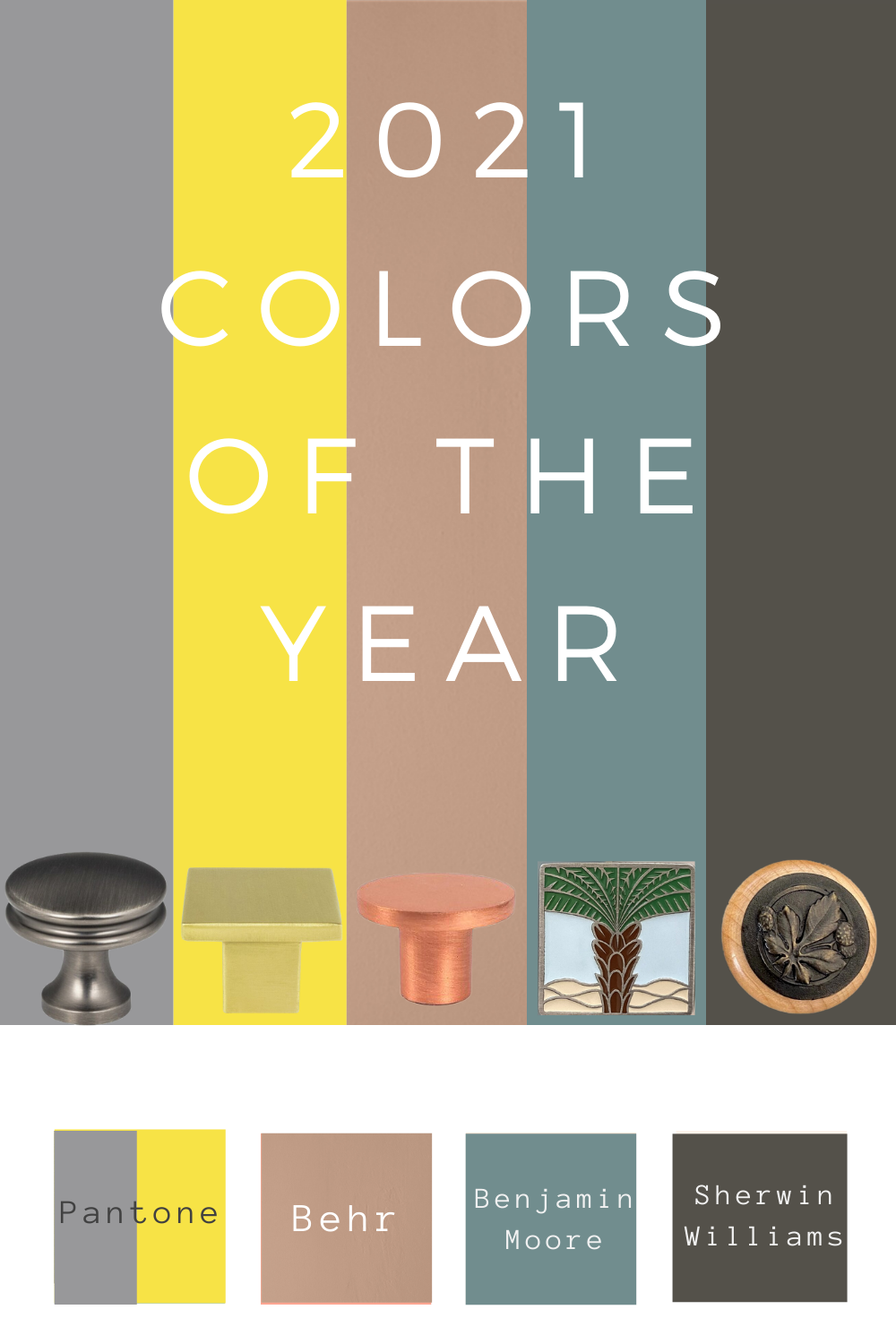
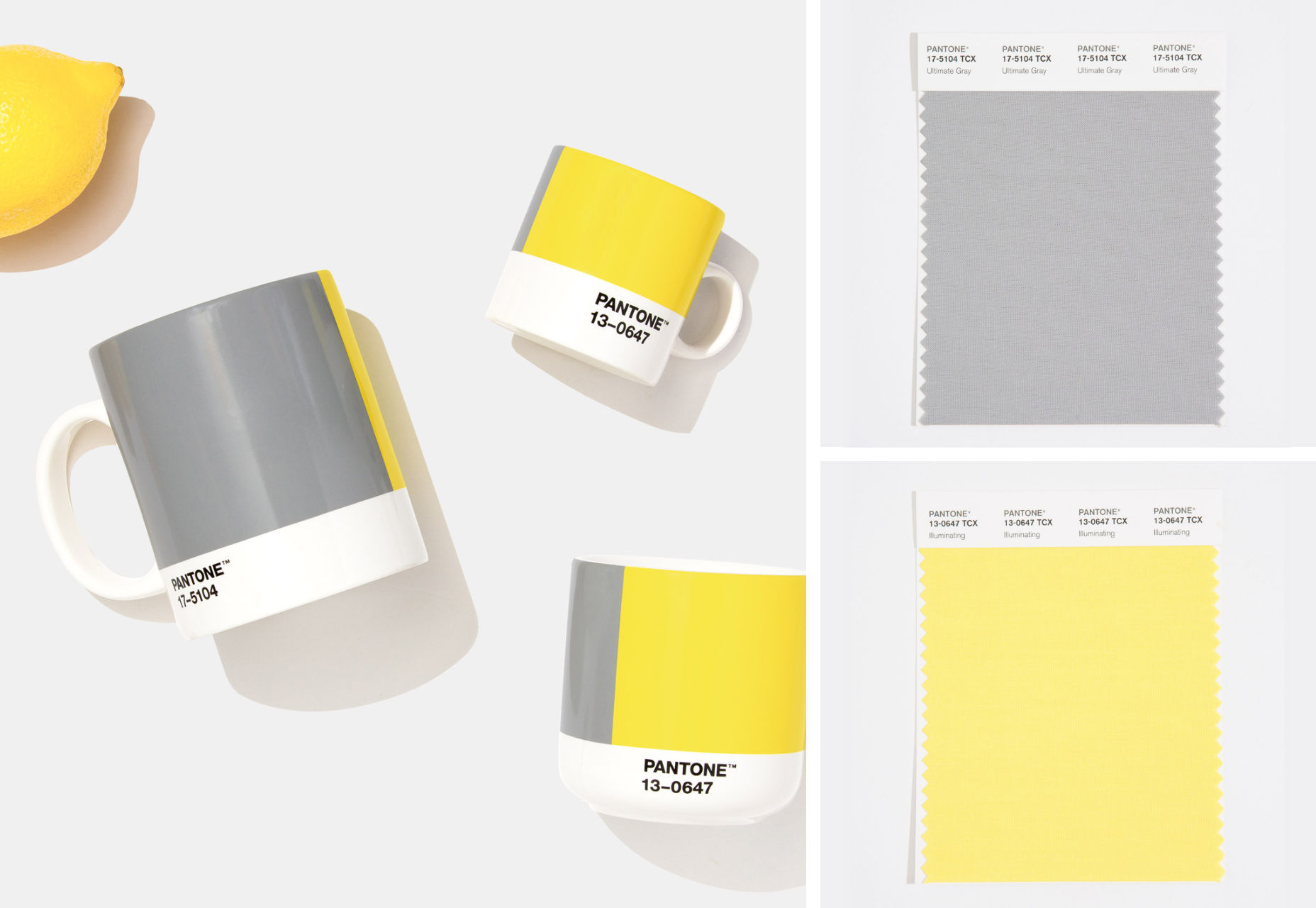
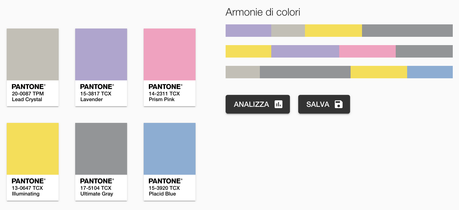
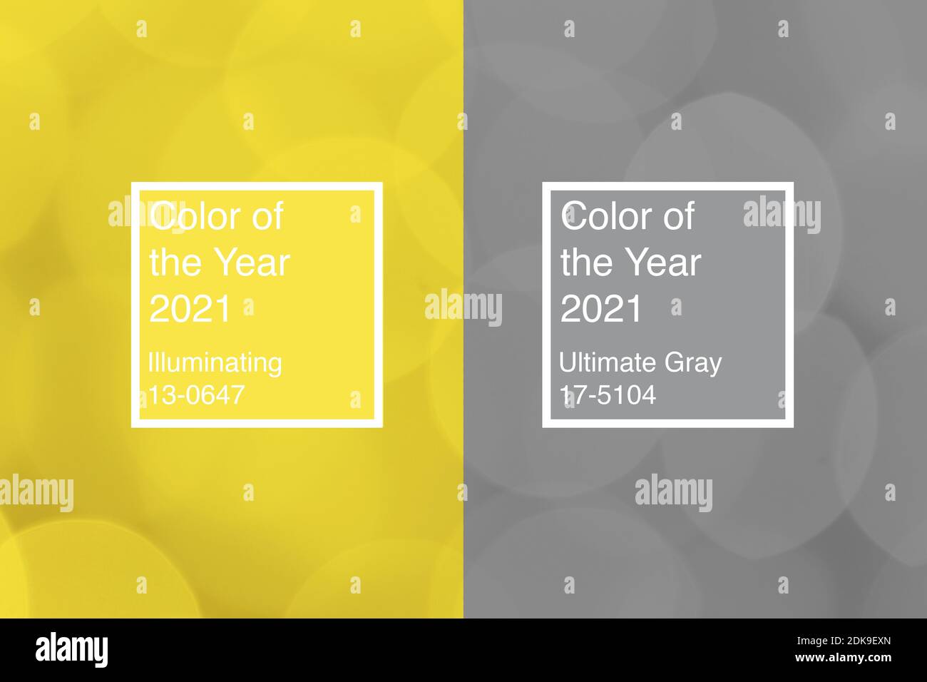
In 2021, the Pantone Color Institute selected a unique pairing of two independent colors: Pantone 17-5104 Ultimate Gray and Pantone 13-0647 Illuminating. This combination was designed to convey a message of strength and hopefulness, symbolizing a resilient foundation paired with a bright, optimistic outlook for a world emerging from unprecedented global challenges.
The Selection of Ultimate Gray and Illuminating: A Rare Duo
The announcement of the 2021 Color of the Year was a significant departure from tradition. While Pantone typically selects a single shade to represent the global zeitgeist, 2021 marked only the second time in history that two colors were chosen together (the first being Rose Quartz and Serenity in 2016). This decision was not merely aesthetic; it was a deliberate narrative choice intended to reflect the complexity of the era.
Ultimate Gray represents the solid and dependable elements that provide a firm foundation. It is the color of pebbles on the beach and weathered natural elements that have stood the test of time, signaling quiet assurance and resilience. In contrast, Illuminating is a bright and cheerful yellow sparkling with vivacity—a warming shade imbued with solar power.
The union of these two independent colors was meant to highlight how different elements come together to support one another. It was a visual representation of the idea that neither strength nor optimism exists in a vacuum; rather, they are interdependent. In the design world of 2026, we look back at this pairing as the catalyst for the "functional optimism" movement that dominated the early 2020s.
The Symbolic Meaning: Resilience and Optimism
To understand the 2021 choice, one must look at the psychological weight assigned to these specific hues. Color psychology suggests that our brains process gray and yellow in fundamentally different ways, and their combination creates a specific cognitive harmony.
The Psychology of Ultimate Gray
Gray is often unfairly characterized as dull or somber. However, in the context of "Ultimate Gray," the Pantone Color Institute emphasized its connection to fortitude. It is the color of granite, industrial steel, and ancient stone structures. Psychologically, it offers a sense of composure, steadiness, and "is-ness." During a period of intense volatility, this color served as a stabilizing force, providing a neutral backdrop against which more vibrant emotions could be processed.
The Psychology of Illuminating
Yellow is universally recognized as the color of the sun, joy, and intellectual energy. "Illuminating" specifically avoids the neon or acidic qualities of some yellows, leaning instead toward a friendly, approachable brightness. It stimulates the logical side of the brain and encourages a forward-looking mindset. In 2021, this was essential for mental health and morale, offering a "light at the end of the tunnel" after the lockdowns of 2020.
The Power of the Pairing
When paired, the colors create a "reset" effect. The gray provides the grounding, while the yellow provides the aspiration. This duality reflected the human condition at the time: the need to be seen, to be visible, and to be recognized, while simultaneously needing the safety of a stable, unshakeable environment. This concept of "grounded hope" remains a cornerstone of architectural and interior design strategies today in 2026.
The Cultural and Global Context of 2021
The selection of a Color of the Year is never a coincidence; it is the result of deep trend analysis by the Pantone Color Institute. To appreciate the 2021 selection, we must recall the specific socio-economic climate of that period.
- Post-Pandemic Recovery: The world was beginning to navigate the rollout of vaccines and the "new normal." There was a collective yearning for stability (Gray) but an equally powerful desire to celebrate life and movement again (Yellow).
- Digital Integration: As remote work became permanent for many, our domestic spaces became our professional spaces. The need for a color palette that was both professional/neutral and energizing/stimulating was at an all-time high.
- Social Movements: 2020 and 2021 were years of significant social upheaval and calls for systemic change. The pairing of two colors represented the necessity of solidarity—different groups working together toward a unified future.
The "meaning" of the 2021 color choice was, therefore, a manifesto for collective endurance. It acknowledged that the road ahead would be difficult (the gray) but promised that there was warmth and clarity to be found (the yellow).
Implementation in Design and Industry (2021–2026)
The influence of Ultimate Gray and Illuminating extended far beyond a simple paint swatch. It permeated multiple industries, setting a precedent for how color is used to influence consumer behavior and emotional well-being.
Interior Design and Home Decor
In the years following the announcement, interior designers moved away from the "all-white" minimalism of the 2010s. Ultimate Gray became the preferred neutral for cabinetry, flooring, and large-scale upholstery, replacing the cooler, more sterile grays of previous decades. Illuminating was utilized as an "accent of intent"—found in throw pillows, kitchen appliances, and front doors. This created spaces that felt sophisticated yet welcoming.
Fashion and Textiles
The fashion industry embraced the duo through high-contrast patterns and athletic wear. Gray provided the technical, high-performance base, while yellow served as the safety and visibility component. Brands like Nike and Adidas heavily incorporated these tones into their 2021-2022 collections, a trend that evolved into the "hi-vis" fashion movements we still see in urban techwear today.
Graphic Design and Digital Media
For UI/UX designers, the 2021 pairing solved a significant problem: accessibility. The high contrast between a deep gray and a vibrant yellow is ideal for readability and digital navigation. This combination became a staple for Fintech and health-tech apps, where the goal was to convey both trustworthiness (gray) and innovation (yellow).
Comparative Analysis of Pantone Trends
To understand why the 2021 choice was so pivotal, it is helpful to see it in the context of the years surrounding it.
| Year | Pantone Color(s) | Primary Theme | Lasting Impact |
|---|---|---|---|
| 2020 | Classic Blue | Stability & Connection | Re-established deep blues as a standard for professional branding. |
| 2021 | Ultimate Gray & Illuminating | Resilience & Hope | Introduced the "Functional Optimism" aesthetic in design. |
| 2022 | Very Peri | Transition & Creativity | Sparked the widespread use of purples in digital and metaverse design. |
| 2023 | Viva Magenta | Fearlessness & Joy | Encouraged bold, expressive color choices in fashion and interiors. |
| 2024 | Peach Fuzz | Compassion & Connection | Shifted focus toward tactile warmth and "soft" minimalism. |
The move from the solid, traditional "Classic Blue" of 2020 to the split personality of 2021 showed a world that had become more complex and less certain of a single path forward.
Lasting Influence: Where Are These Colors in 2026?
As we stand in 2026, the 2021 Color of the Year continues to influence the market in subtle but profound ways. We no longer see them as a "trend" but as a foundational color theory principle.
1. The Rise of "Dopamine Decor": The use of Illuminating yellow was the precursor to the "Dopamine Decor" movement of the mid-2020s. People realized that bright, saturated colors could actively improve their mood. While the 2021 version was somewhat restrained by the accompanying gray, it gave consumers the "permission" to bring bright yellows back into their homes.
2. Sustainability and the "Concrete" Aesthetic: Ultimate Gray aligned perfectly with the rising interest in sustainable, raw materials. Polished concrete floors, recycled stone countertops, and brutalist-inspired furniture became staples of eco-conscious luxury. The "Ultimate Gray" of 2021 validated the beauty of raw, industrial materials that don't require heavy chemical dyeing or processing.
3. Workplace Design: The "Resilient Optimism" palette is now the standard for modern co-working spaces. The gray provides a low-distraction environment for deep focus, while yellow zones are used for brainstorming and social interaction. This spatial division of labor via color is a direct legacy of the 2021 narrative.
Technical Specifications for Designers
For those looking to recreate or reference this palette in 2026, the technical data remains essential for color matching across media.
- Ultimate Gray (Pantone 17-5104):
- CMYK: 40, 30, 30, 11
- RGB: 147, 149, 151
- Hex: #939597
- Illuminating (Pantone 13-0647):
- CMYK: 1, 1, 95, 0
- RGB: 245, 223, 77
- Hex: #F5DF4D
Designers should note that these colors work best when the gray occupies approximately 70-80% of the visual field, with the yellow acting as a focal point to draw the eye or highlight key information.
Practical Guidance for Using These Colors Today
If you are considering integrating the 2021 legacy into a current project, avoid the mistake of using them in equal proportions. The "meaning" of the pairing relies on the yellow feeling like a breakthrough.
- In Residential Interiors: Use Ultimate Gray for the "bones" of the room—walls or large sofas. Introduce Illuminating through accessories like glass vases, art pieces, or even a single accent chair. This prevents the yellow from becoming overwhelming or "nursery-like."
- In Branding: This combination is excellent for brands that want to appear established but innovative. Think of a consulting firm or a construction technology company. The gray says, "We are solid," while the yellow says, "We have the bright ideas."
- In Fashion: Look for gray fabrics with yellow top-stitching or linings. This "hidden optimism" adds a level of sophistication and detail that was popular in the high-fashion runways of 2024 and 2025.
Frequently Asked Questions
Why did Pantone choose two colors in 2021?
Pantone chose two colors to represent the idea that "no one is an island." The pairing symbolized the need for support, solidarity, and the combination of different elements to create a stronger whole. It reflected a world that needed both a solid foundation (Gray) and a hopeful outlook (Yellow) to move past the pandemic.
What is the hex code for the 2021 Pantone colors?
The hex code for Ultimate Gray is #939597, and the hex code for Illuminating is #F5DF4D. These codes allow designers to accurately reproduce the colors in digital environments such as web design and social media graphics.
Is the 2021 color trend still relevant in 2026?
Yes, but it has evolved. While you may see fewer people painting their entire kitchens in this specific yellow, the philosophy of combining reliable neutrals with "mood-boosting" accents is a permanent fixture in modern design. Ultimate Gray, in particular, has become a standard neutral that has replaced cooler grays.
What was the meaning behind "Ultimate Gray"?
Ultimate Gray was chosen to represent resilience, composure, and a firm foundation. It mimics the appearance of natural elements like stone and granite, which are enduring and provide a sense of steady assurance during turbulent times.
How do I balance these colors in a small space?
In small spaces, lean heavily on the gray to provide a sense of expansiveness and calm. Use the yellow sparingly in areas where natural light hits, such as on a window sill or a small piece of wall art. This creates a "glow" effect without making the room feel cluttered or over-stimulated.
Next Actions for Designers and Homeowners
To effectively utilize the context of the 2021 Color of the Year in a modern 2026 context, start by auditing your current palette. If your space feels too sterile or "flat," consider introducing a "pop" of Illuminating yellow through soft goods or lighting. If your space feels chaotic, use the principles of Ultimate Gray to introduce grounding elements like stone textures or matte gray finishes.
For professional designers, the 2021 duo serves as a reminder to look for the "story" behind a color choice. When presenting a palette to a client, don't just focus on what looks good—focus on the emotional resilience and optimism that the colors can provide to the end-user.