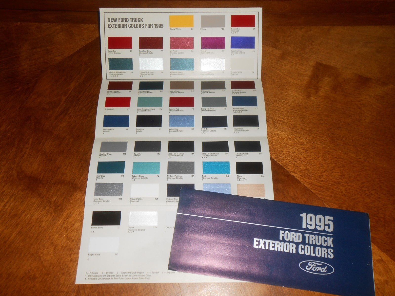
The year 1995 marked a pivotal inflection point in the evolution of color technology, digital imaging, and interior design aesthetics. As the midpoint of a decade dominated by both neon exuberance and the dawn of mainstream web graphics, 1995 color standards established the foundational frameworks for how humans capture, reproduce, and experience color across analog and digital mediums.
Analyzing the concept of "1995 color" requires looking at how a specific convergence of hardware limitations, software milestones, and cultural shifts defined a distinct palette and technical standard. From the standardization of web-safe color palettes to the commercialization of digital photography and specific paint trends of the mid-1990s, this era created a unique visual footprint that continues to influence contemporary nostalgic design movements.
The Technological Constraints: The Genesis of the Web-Safe Palette
In 1995, the digital landscape was undergoing a massive structural transformation. The World Wide Web was transitioning from a purely academic environment into a commercial medium, spearheaded by the release of Windows 95 and early iterations of web browsers like Netscape Navigator. However, a major technical barrier existed: the vast majority of personal computers at the time were limited to 8-bit graphics cards, which could only display a maximum of 256 colors simultaneously.
This hardware limitation created a severe design challenge. If a web designer used a color outside of a computer's native capability, the operating system would attempt to approximate it using dithering—a process of placing pixels of different colors side by side to simulate a blend. Dithering on 256-color displays often resulted in grainy, unpredictable visual artifacts.
To solve this problem, browser manufacturers and system architects developed the "Web-Safe Color Palette," frequently associated with mid-1990s digital design. This palette consisted of 216 specific colors that would render consistently and without dithering across both Macintosh and PC platforms operating on 8-bit displays.
The Mathematics of the 216-Color Palette
The web-safe palette was built upon a mathematically sound foundation using the RGB (Red, Green, Blue) color model. Each of the three color channels was restricted to six possible intensity values: 0%, 20%, 40%, 60%, 80%, and 100%. In hexadecimal values, these correspond to:
00(0)33(51)66(102)99(153)CC(204)FF(255)
Multiplying these six values across the three color channels ($6 \times 6 \times 6$) yielded exactly 216 colors. This restricted spectrum defined the visual aesthetic of the early internet. While modern displays capable of rendering millions of colors (True Color) rendered these restrictions obsolete by the late 1990s, the 1995 web-safe palette remains a classic case study in designing within strict technical parameters.
| Color Channel Value (Hex) | Decimal Equivalent | Percentage Intensity | Visual Impact on 8-Bit Displays |
|---|---|---|---|
00 |
0 | 0% | Complete absence of the color channel (Shadow/Black baseline) |
33 |
51 | 20% | Dark, muted tone providing deep contrast |
66 |
102 | 40% | Mid-tone shade commonly used for UI borders and backgrounds |
99 |
153 | 60% | Brighter secondary tone for text or highlights |
CC |
204 | 80% | High-luminosity tone approaching pastel or neon territory |
FF |
255 | 100% | Full saturation of the channel (Pure Red, Green, or Blue) |
Analog-to-Digital Transition: Printing and Publishing in 1995
Beyond the computer screen, 1995 was a transformative year for desktop publishing and color management in the physical printing industry. Before this era, color separation and prepress work required specialized, expensive hardware workstations operated by trained lithographers. By 1995, powerful desktop publishing software—such as Adobe Photoshop 3.0 (which introduced layers in late 1994 and dominated workflows through 1995), QuarkXPress, and Adobe Illustrator—demanded more reliable methods for matching screen color to printed output.
The industry-standard CMYK (Cyan, Magenta, Yellow, Black) color model faced massive hurdles regarding color consistency across different monitors and printing presses. In 1993, the International Color Consortium (ICC) was established by eight industry vendors to create an open, vendor-neutral color management system. By 1995, the groundwork laid by the ICC began manifesting in early color profiling software, allowing graphic designers to embed color profiles into files for the first time.
Despite these advancements, managing color accuracy in 1995 remained an artisanal trial-and-error process. Printers relied heavily on physical swatch books, most notably the Pantone Matching System (PMS), to communicate exact color specifications between designers and commercial printers, circumventing the discrepancies of uncalibrated CRT (Cathode Ray Tube) monitors.
Interior Design and Consumer Aesthetics of 1995
While digital technology was grappling with 256-color limits, the physical world of interior design, fashion, and consumer goods in 1995 maintained a distinct palette that bridged the transition from the vibrant early 1990s to the more muted, minimalist late 1990s.
The early part of the decade had been heavily influenced by primary colors, bright neons, and southwestern motifs (such as teal, terracotta, and dusty rose). By 1995, a noticeable shift occurred toward warmer earth tones, rich jewel tones, and sophisticated neutrals.
Key Color Categories in 1995 Consumer Goods
- Warm Neutrals: Beige, cream, and taupe dominated residential interiors, moving away from the stark white walls of the 1980s.
- Jewel Tones: Deep hunter greens, burgundy, and sapphire blue were ubiquitous in home textiles, automotive interiors, and formal apparel.
- Earth Tones: Rust, terracotta, and mustard yellow retained a strong presence, particularly in kitchen appliances and casual dinnerware.
- The Rise of Translucent Plastics: Influenced heavily by the 1998 release of the iMac G3 (though prototyped and conceptualized in design trends developing through the mid-1990s), consumer electronics began utilizing smoky, translucent colored plastics, moving away from office-beige computer hardware.
Common Misconceptions Regarding 1995 Color Standards
When examining historical color technology, several recurring myths and misunderstandings often surface among modern designers and developers.
- "The web-safe palette was used because people preferred flat, simple colors." This is false. The 216-color palette was strictly a technical workaround mandated by hardware limitations of 8-bit video cards. As soon as 16-bit and 24-bit color cards became affordable and standard in the late 1990s, web designers rapidly abandoned the restricted palette in favor of gradients, photographic imagery, and smooth color transitions.
- "Color management in 1995 was fully automated." Many assume that digital files have always maintained color fidelity across devices. In 1995, color management was in its infancy. A graphic designed on an Apple Macintosh often appeared significantly darker or more saturated when viewed on an IBM-compatible PC running Windows 95 due to differing gamma settings (Macintosh traditionally used a gamma of 1.8, while Windows utilized 2.2).
- "1995 design was exclusively pastel." While pastel colors appeared in specific domestic contexts, the dominant commercial palette of 1995 favored deep, saturated earth and jewel tones, contrasting sharply with the neon aesthetics of the preceding years.
Troubleshooting Color Inconsistencies in Legacy Digital Archives
Researchers, web historians, and digital preservationists frequently work with digital assets, software, and websites originating from 1995. Reproducing or analyzing the authentic color profile of these artifacts requires understanding specific technical troubleshooting steps:
- Addressing Gamma Discrepancies: When viewing 1995 web design assets or digital images today, modern operating systems apply a standard gamma of 2.2. If the asset was created specifically for a legacy Macintosh environment with a 1.8 gamma, colors will appear noticeably darker. Adjusting display profiles or image exposure compensation is often necessary to view the asset as the original designer intended.
- Mitigating Palette Banding: Attempting to view an 8-bit indexed image from 1995 on a modern high-dynamic-range (HDR) display can sometimes expose compression artifacts or unintended color banding. Utilizing image editing software to convert the color mode back to an indexed 256-color palette can reveal the authentic rendering limitations of mid-1990s hardware.
- Cross-Platform Verification: Because Netscape Navigator and early Internet Explorer engines rendered default system colors differently across Windows 95 and Mac OS System 7.5, verifying historical web design requires testing within emulated environments that replicate period-accurate video drivers and color depths.
Frequently Asked Questions
What made the 1995 web-safe color palette necessary?
The web-safe palette was required because standard consumer computers in 1995 used 8-bit graphic cards limited to displaying 256 colors at once. Using colors outside the standardized 216-color intersection caused operating systems to dither images, creating unwanted visual noise and grainy patterns.
How many colors were in the standard web-safe palette of the mid-1990s?
The standard web-safe palette contained exactly 216 colors. This number was derived by combining six uniform intensity levels for each of the three primary RGB color channels ($6 \times 6 \times 6 = 216$).
Why did Macintosh and Windows computers display 1995 colors differently?
Macintosh computers and Windows PCs utilized different native gamma correction standards during the mid-1990s. Macs typically operated at a gamma of 1.8, resulting in brighter mid-tones, while Windows PCs operated at a gamma of 2.2, producing darker, more heavily contrasted images.
Are web-safe colors still relevant in modern web design?
No. Modern displays support millions of colors (True Color), and contemporary CSS supports named colors, RGBa, hex codes, and HSL values. The web-safe palette is now historically interesting rather than technically necessary.
What interior design colors were popular in 1995?
The mid-1990s interior design market favored warm neutrals like beige and taupe, alongside rich jewel tones such as hunter green, burgundy, and deep navy blue, replacing the bright neons of the late 1980s.
Conclusion and Next Actions
Understanding the nuances of 1995 color requires examining the intersection where hardware engineering forced creative compromise. Whether you are archiving digital history, studying the evolution of graphic design standards, or exploring retro interior aesthetics, recognizing the technical limitations of 8-bit displays and early color management provides valuable context for modern digital workflows. To apply this knowledge, examine your current digital asset management pipelines to ensure color profiles are properly embedded, or explore retro-computing emulators to experience firsthand how digital media was rendered during the mid-1990s.